What Is Mobile SEO?
Mobile SEO refers to the process of optimising a website so that it performs effectively on smartphones and tablets.
This involves improving several aspects of a website, including:
- Page speed on mobile networks
- Layout and readability on smaller screens
- Technical SEO accessibility for search engines
- Content structure for mobile readers
The goal of mobile SEO is to ensure users can easily access information and interact with a website regardless of the device they are using. (Source: Google Search Central)
Unlike “desktop-first” optimisation, mobile SEO focuses heavily on usability. Search systems increasingly favour pages that load quickly, feel stable while loading, and are easy to interact with on a small touchscreen. (Source: Google Search Central)
Why Mobile SEO Matters for Businesses
Mobile optimisation has become essential because user behaviour has shifted dramatically over the past decade.
Mobile-first indexing affects what Google evaluates
Because Google primarily uses the mobile version for indexing and ranking, gaps between your desktop and mobile pages can hurt performance. If mobile pages load slowly, hide important content, or remove structured information, search visibility can be affected. (Source: Google Search Central)
Mobile users behave differently
Mobile visitors tend to search quickly, skim information, and expect sites to load fast. When a page feels clunky, people don’t “wait it out”, they hit back and pick another result.
Mobile UX connects to business outcomes
If users struggle to navigate your site on their phones due to poor UI and UX, they may abandon it before completing actions such as calling, sending a WhatsApp message, booking an appointment, or purchasing a product.
In short, mobile SEO connects search visibility, usability, and business outcomes.
Core Aspects of Mobile SEO
Mobile SEO works best when businesses optimise several areas simultaneously. It is not a single tactic but rather a combination of technical SEO, on-page SEO, and content SEO.
Below are the core elements that shape mobile SEO performance.
Technical SEO for Mobile
Technical SEO provides the infrastructure that allows search engines to crawl and understand a mobile website.
Important technical considerations include:
- Responsive web design
- Crawlable CSS, images, and JavaScript
- Proper viewport configuration
- Consistent content across desktop and mobile pages
Responsive design is widely recommended because it allows a website to adapt automatically to different screen sizes while maintaining a single URL structure. This simplifies crawling and indexing and reduces maintenance overhead. (Source: Google Search Central)
Practical tip: aim for “mobile parity.” Your mobile version should contain the same primary content, headings, internal links, and structured elements you want Google to understand. (Source: Google Search Central)
Mobile Page Speed
Speed is one of the most important factors affecting both rankings and user experience.
Mobile users often rely on mobile data connections rather than high-speed desktop networks. As a result, slow websites can quickly frustrate visitors.
Improving speed typically involves:
- Compressing large images
- Reducing unnecessary scripts
- Using caching technologies
- Improving server response times
Google evaluates real-world page experience using Core Web Vitals, a set of metrics focused on loading (LCP), interactivity (INP), and visual stability (CLS). (Sources: Google Search Central; Google Search Central Blog)
A quick note for 2026: if you still see older advice focused on FID, Google introduced INP as the replacement and transitioned it into Core Web Vitals, so “FID-only” guidance is outdated. (Sources: Google Search Central Blog; web.dev)
It’s also worth keeping expectations realistic. Google notes that page experience signals can help when competing pages are similarly relevant, but they do not override relevance. (Source: Google Search Central)
Mobile Layout and Responsive Design
A mobile-friendly layout ensures that content remains easy to read and interact with on small screens.
Effective mobile layouts include:
- Flexible layouts that adapt to screen size
- Readable text without zooming
- Proper spacing between clickable elements
- Buttons large enough for touch interaction
When layouts are poorly optimised, users may need to zoom, scroll sideways, or struggle to tap links accurately. These problems create frustration and often lead visitors to leave the website quickly.
Ease of Navigation and Browsing
Navigation plays a major role in mobile usability. Mobile users often browse with one hand and expect information to be accessible quickly.
Good mobile navigation typically includes:
- Clear and simplified menus
- Logical page hierarchy
- Prominent call-to-action buttons
- Easy access to contact options such as phone or WhatsApp
If users cannot quickly find the information they need, they may abandon the site and search for another option.
Content SEO for Mobile Readers
Content structure affects how well a page performs on mobile devices.
Mobile-friendly content generally includes:
- Shorter paragraphs that are easy to scan
- Clear headings that guide readers through the page
- Bullet points that highlight key information
- Direct answers near the top (especially for service pages and FAQs)
These formatting improvements help users quickly locate relevant information, and they make it easier for search systems to understand the main points of the page. (Source: Google Search Central)
Mobile Search Behaviour in Malaysia
Understanding how users search is just as important as technical optimisation.
Mobile users often perform searches with immediate intent. They may be looking for a nearby restaurant, comparing services, or searching for directions.
Common mobile searches include:
- Nearby businesses
- Opening hours
- Contact details
- Product comparisons
In Malaysia, mobile users frequently combine search with messaging platforms. Many customers prefer contacting businesses through WhatsApp or clicking directly to call.
Because of this behaviour, websites that prioritise quick answers, visible contact options, and clear service information tend to perform better.
Local SEO signals such as Google Business Profile listings also play an important role in mobile search visibility. Google’s guidance highlights that accurate and complete Business Profile information supports better visibility for relevant local searches. (Source: Google Business Profile Help)
Mobile SEO Checklist (2026)
If you want a practical “start here” list, use this checklist to prioritise changes that typically deliver the biggest improvements.
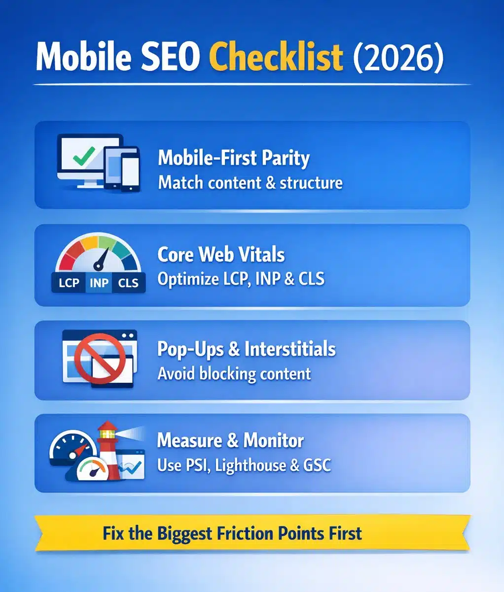
Mobile-first parity
- Confirm your mobile pages include the same primary content as desktop pages
- Keep headings, internal links, and structured elements consistent
- Avoid hiding important content behind patterns that don’t expand reliably on mobile
(Source: Google Search Central)
Core Web Vitals basics
- LCP: reduce heavy images, fonts, and render-blocking scripts
- INP: reduce long tasks, heavy JavaScript, and delayed interactions
- CLS: reserve space for images/ads and avoid late-loading UI shifts
(Sources: Google Search Central; Google Search Central Blog; web.dev)
Avoid disruptive pop-ups
- Keep banners and interstitials from blocking content on entry
- Make cookie/legal notices compact and easy to dismiss
(Source: Google Search Central)
Measure using the right tools
- Use PageSpeed Insights to review performance data and improvement opportunities
- Use Lighthouse for repeatable audits during development
- Use Search Console to monitor mobile usability and indexing signals over time
(Sources: PageSpeed Insights documentation; Chrome Developers)
Examples of Mobile SEO in Practice
To better understand mobile SEO, consider how it works in real-world scenarios.
Example: Restaurant Website
A restaurant website optimised for mobile SEO may include:
- Fast-loading menu pages
- Clear directions and map integration
- Clickable phone numbers for reservations
- Large buttons for food delivery platforms
These features help users quickly find what they need when searching from a smartphone.
Example: Service-Based Business
A service business such as plumbing or air-conditioning repair may optimise its mobile website by providing:
- Clear service descriptions
- Quick contact options
- Prominent call buttons
- Fast-loading pages with minimal clutter
Because many customers search for services urgently, speed and accessibility can significantly influence conversions.
Common Mobile SEO Problems
Many websites struggle with mobile SEO because they were originally designed for desktop viewing.
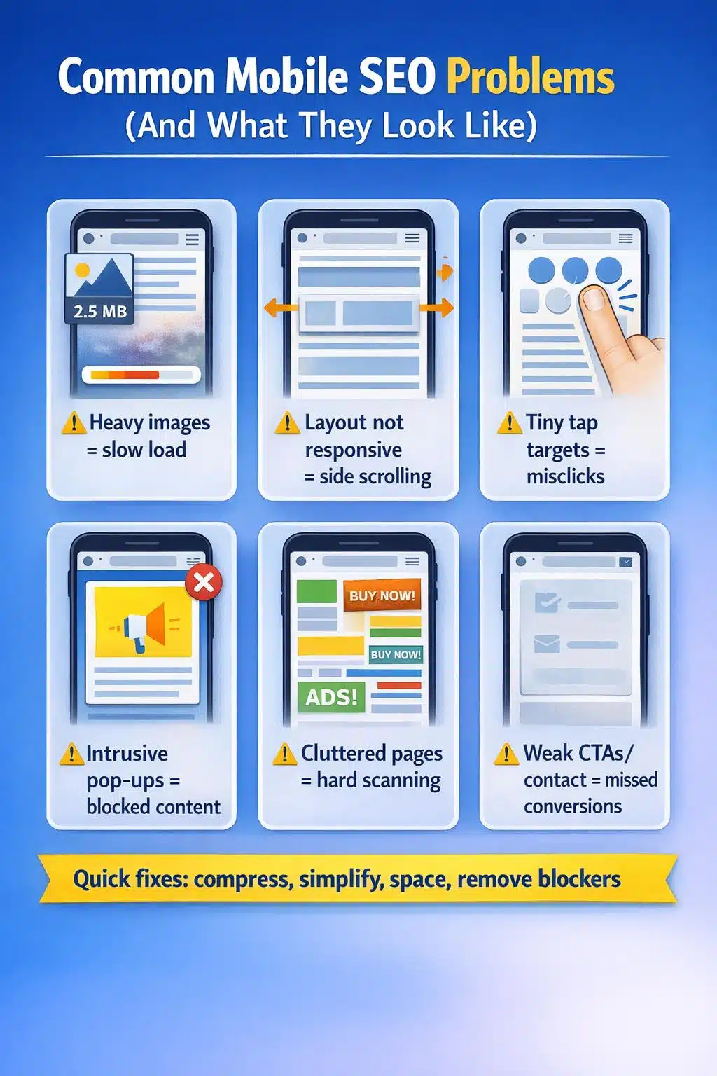
Even websites with strong content can perform poorly if these technical and usability issues are not addressed.
How Businesses Can Start Improving Mobile SEO
Businesses looking to improve mobile SEO should approach it systematically.
Step 1: Evaluate mobile performance using diagnostic tools
Use PageSpeed Insights for performance signals and opportunities, and Search Console for indexing and usability monitoring. (Source: PageSpeed Insights documentation)
Step 2: Review your website on real devices
Test on multiple phones (iPhone + Android if possible). Look for issues automated tools miss: awkward menus, sticky headers hiding content, buttons too small, forms that are frustrating to complete.
Step 3: Fix the biggest friction points first
Start with changes that directly affect users:
- compress heavy images
- remove unnecessary scripts and trackers
- simplify navigation
- improve spacing and tap targets
- tighten content structure (headings, bullets, direct answers)
Mobile SEO optimisation is not a one-time adjustment but an ongoing process that evolves as user behaviour and technology change.
Mobile SEO is the Future of Search Engines
Mobile SEO has become a central part of digital visibility as smartphones dominate how people search and browse the internet. Businesses that prioritise mobile-friendly design, fast loading speeds, and easy navigation are far more likely to attract and retain visitors.
If your business wants to improve search visibility and compete effectively online, professional guidance can help accelerate results. Rankpage’s SEO services help Malaysian companies build SEO strategies that work across mobile search, desktop search, and emerging AI-driven discovery platforms. Contact Malaysia’s number one SEO agency Rankpage today, to ensure your company does mobile SEO the right way!